

Flexbox


Flexbox
By default container has property of display: block; i.e. each element on the next line.
- display: flex;
using this all elements added side by side. once display flex activated on container it unlocks flex-direction ,align-items , justify-content .
- flex-direction
column : Items are placed top to bottom.
column-reverse: Items are placed bottom to top.
row: Items are placed the same as the text direction.
row-reverse: Items are placed opposite to the text direction.
column: Items are placed top to bottom.
column-reverse: Items are placed bottom to top.
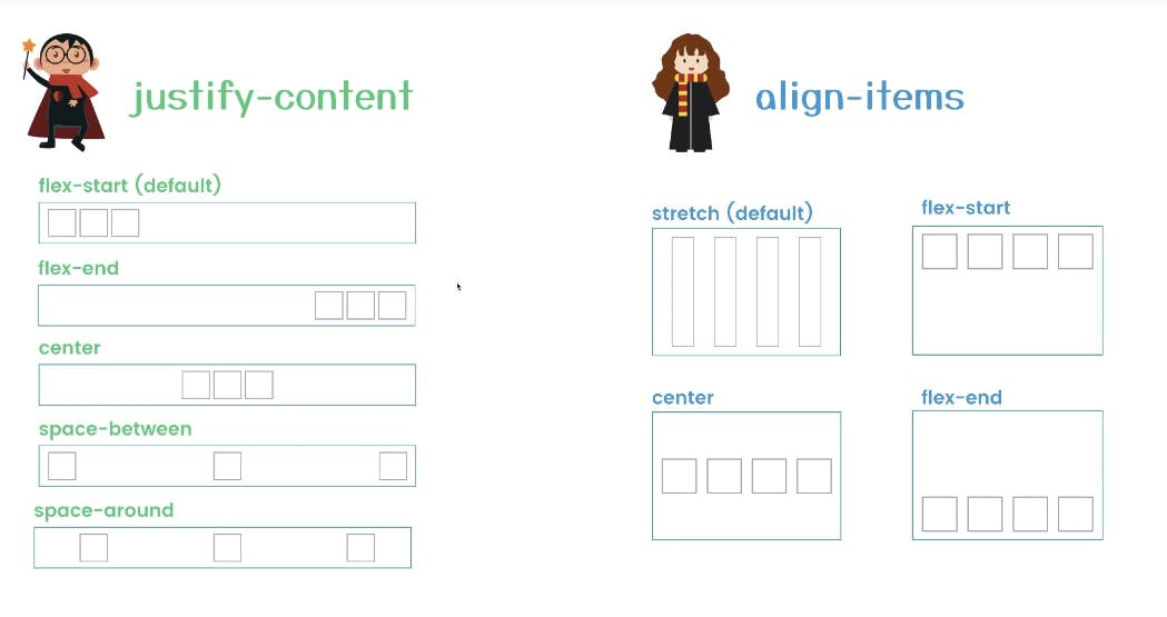
- align-items
align-items : stretch;(default)
align-items : center;
align-items : flex-end;
align-items used for vertical alignment.
- align-self
This property accepts the same values as align-items and its value for the specific item.
- justify-content
justify-content : flex-start;(default)
justify-content : center;
justify-content : flex-end;
justify-content : space-around;
justify-content : space-between;
justify-content used for Horizontal alignment
- Order
Sometimes reversing the row or column order of a container is not enough. In these cases, we can apply the order property to individual items. By default, items have a value of 0, but we can use this property to also set it to a positive or negative integer value (-2, -1, 0, 1, 2).
- flex-wrap
nowrap: Every item is fit to a single line.
wrap: Items wrap around to additional lines.
wrap-reverse: Items wrap around to additional lines in reverse.
- flex-flow
The two properties flex-direction and flex-wrap are used so often together that the shorthand property flex-flow was created to combine them. This shorthand property accepts the value of the two properties separated by a space.
For example, you can use flex-flow: row wrap to set rows and wrap them.
- align-content
flex-start: Lines are packed at the top of the container.
flex-end: Lines are packed at the bottom of the container.
center: Lines are packed at the vertical center of the container.
space-between: Lines display with equal spacing between them.
space-around: Lines display with equal spacing around them.
stretch: Lines are stretched to fit the container.
Exercise: